Julie McAleavy
For my first home tour on my new look blog I thought I would show you around a beautiful new build, on a theme of ‘New blog/New build’.
Buying a new build home presents you with a unique challenge – an exciting blank canvas.
However, these properties can be very hard to ‘make your own’. The perfect walls almost resist change, you are not allowed to wallpaper for the first year, to let the plaster settle, there are no period features, and usually no fireplace. When I see people, like Julie, meet this challenge successfully, I am awe. Julie has dug deep to add real individuality to her home. The result she has achieved is totally unique, warm and welcoming, and located in a friendly, supportive community. Her sons are surrounded by playmates. The whole project has been a real winner.
Julie was tempted by a new build initially thanks to a part exchange incentive, which was a huge help financially and enabled her to buy a very spacious home. Working as a designer she needed studio space, she has two little boys now and of course, post lockdown, her husband is also working from home, so it was a very good decision all round.
She lived in the house for a while before making any radical changes, ‘it was so immaculate, it felt wrong to change anything, throwing out a perfectly good kitchen felt very wasteful’ she rues.
However, she slowly began making her mark, she started off by converting the garage into the play room, above. The garage was never used for the car, only as storage space so Julie felt that creating another room would be a much better use of the space. She created clever new storage solutions: the back of the play room is a large cupboard, which helps the proportions of the room, making it less long and narrow, bikes and gardening stuff are in a shed outside. ‘The new room is now a fun space where we all spend time, and it enables me to keep my living room as a calming adult space’ says Julie.
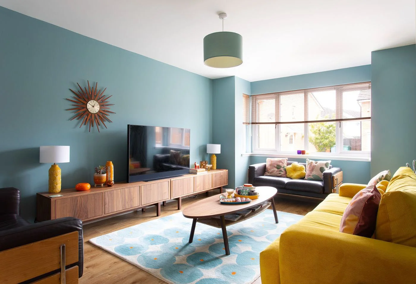
Julie saw the yellow Habitat sofa on display in Sainsburys and knew it would be a perfect fit for the livingroom. The vintage Robin Day sofas were one of the couple’s first major purchases and are only available second hand now. The framed graphic prints are by Inaluxe an Australian design duo that Julie has connected with on Instagram, ‘I really admire their work’ she shares. The colourful nests of tables are from Habitat, the coffee table is from the Stockholm range at Ikea.
Julie has lined up two TV benches from the Stockholm range at Ikea along one wall for maximum impact and practicality. The Stockholm range has served Julie well, it has really helped to create the minimal Scandi vibe that makes her home so cool and works well with the colourful accents she loves to add. The classic starburst clock was a wedding gift and is from John Lewis.
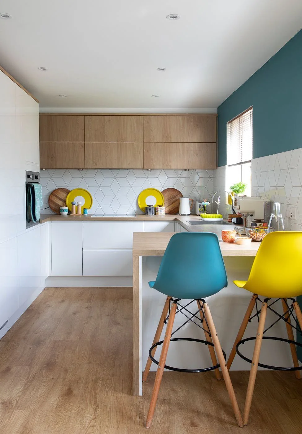
The final room she tackled was the kitchen. ‘It was cream and grey with a white laminate worktop which was not practical’ she says, ‘it marked very easily’. She replaced it with simple handleless white cabinetry and a smart, very forgiving wood appearance laminate worktop.
She replaced a comfy sofa at the end of the dining area, with an ingenious banquette seating solution which she designed herself, inspired by an image she saw on Pinterest. The results are stunning and very comfortable, and it also incorporates a lot of very useful storage.
Julie wanted her hallway to be welcoming and light. She painted the front door her trademark mustard yellow and chose a graphic patterned wallpaper, from Next, to make her home instantly distinctive, the moment you enter. The round mirror with the useful inbuilt shelf is from the Stockholm range from Ikea. The Achille pendant light is from Habitat.
The colourful patterned plastic Vivi runner is from Swedish company Pappelina. She and I are both fans - I love their products so much!
Julie’s boy’s bedrooms are both a joy - she has created a unique and wonderful world for each of them.
The walls in Axel’s room are painted in a bold blue called ‘Bugle Blue’ by Leyland Paints. The framed prints are from Ketchup On Everything and the ‘Global Cheetah’ rug is from Habitat.
Arlo chose the mint green shade for his room himself, they used the Ingela P Arrhenius prints as the starting point for the design. ‘We really enjoyed working on it together’ Julie says. You can find Ingela on Instagram @ingelaparrhenius
Colourful storage makes clearing up toys fun in kid’s rooms. ‘They are both really good at keeping them tidy as well’ she shares.
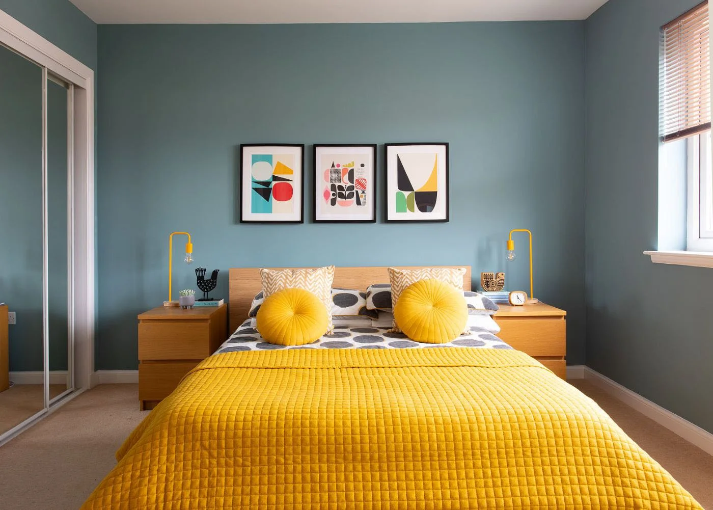
The walls in the master bedroom are painted in ‘Wintery Tide’ by Leyland Paints. Julie has chosen a matching teal pendant light and vibrant yellow velvet cushions, quilted throw and bedside lights for contrast and drama. The prints behind the bed are by Inaluxe that Julie has popped into Ikea Ribba frames. The yellow industrial style bedside lights were from ebay. The round yellow cushions are from Dunelm and the mustard ANYDAY quilted throw is from John Lewis.
There are honestly so many bedrooms in this spacious three storey home: there is a guest suite, above, on the second floor. It used to be the couple’s master bedroom with an ensuite and a little nursery for baby Arlo but Julie didn’t want to be on a different level from the boys once they moved into their own bedrooms so they moved downstairs to a slightly smaller room so that the family were all on the one floor. ‘We will probably take it over as our master bedroom again when the boys are teenagers’ Julie shares, ‘but at the moment, it makes a very peaceful sanctuary for guests who come to stay.’
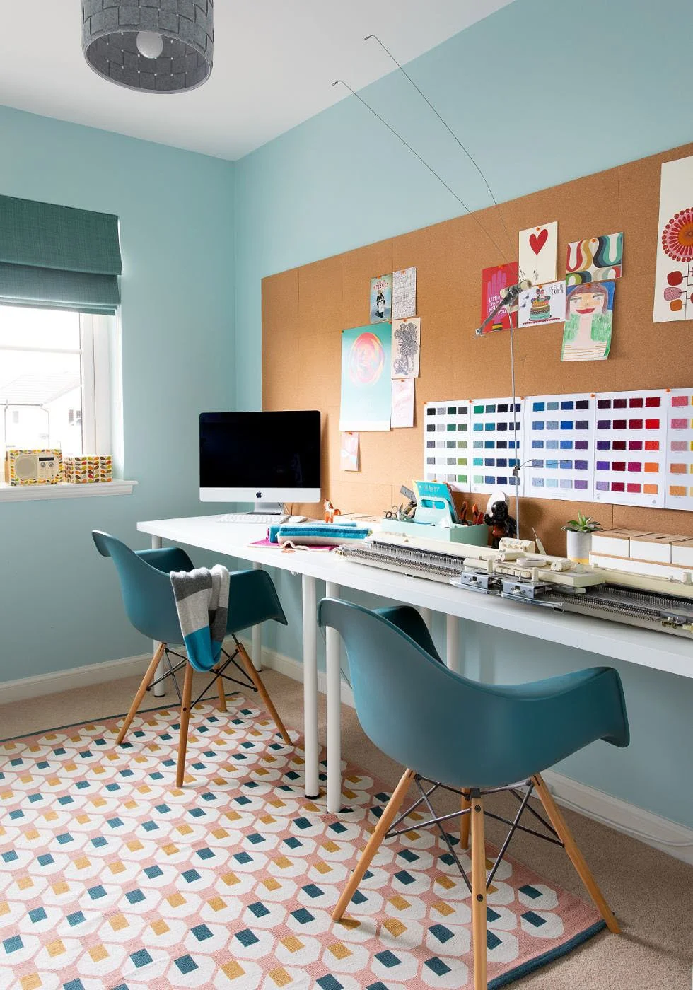
Julie can use one as her design studio. The cork pin board is great for displaying useful colour charts and inspiring images. The peel & stick cork tiles are available from Amazon. Walls are painted in ‘Mint Macaron’ Matt emulsion by Dulux, a similar Vitra style armchair is available from OCHS and the Octo rug is from Habitat.
The benefits of buying a brand new house are huge: ideally there will be no issues with the plumbing, the wiring, the roof or the basic structure, so you know you are entering into a long, happy period of low maintenance living and you can focus on the decor. There is usually a friendly ready made community in a new street, residents are eager to connect and get to know each other. Julie has really appreciated all these factors and it has enabled her to enjoy her sons and continue with her creative work as a designer with minimal stress.
You can find Julie on Instagram @fromcity2suburb
